Artist Painting (unfinished)
- Who was your referenced artist for the painting? Name 4 main ideas you used from your research to create your painting.
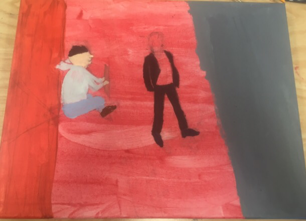
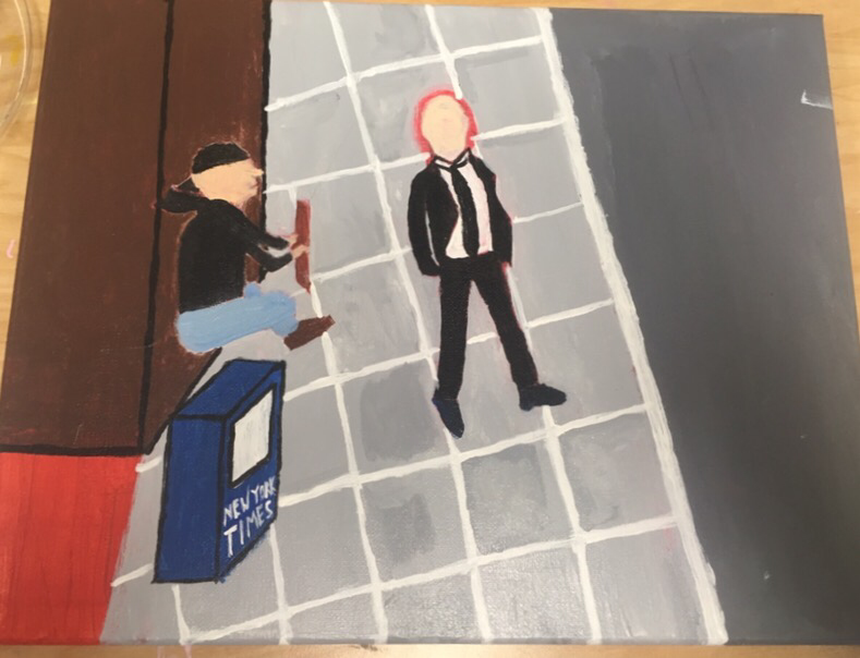
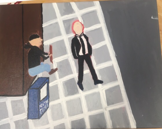
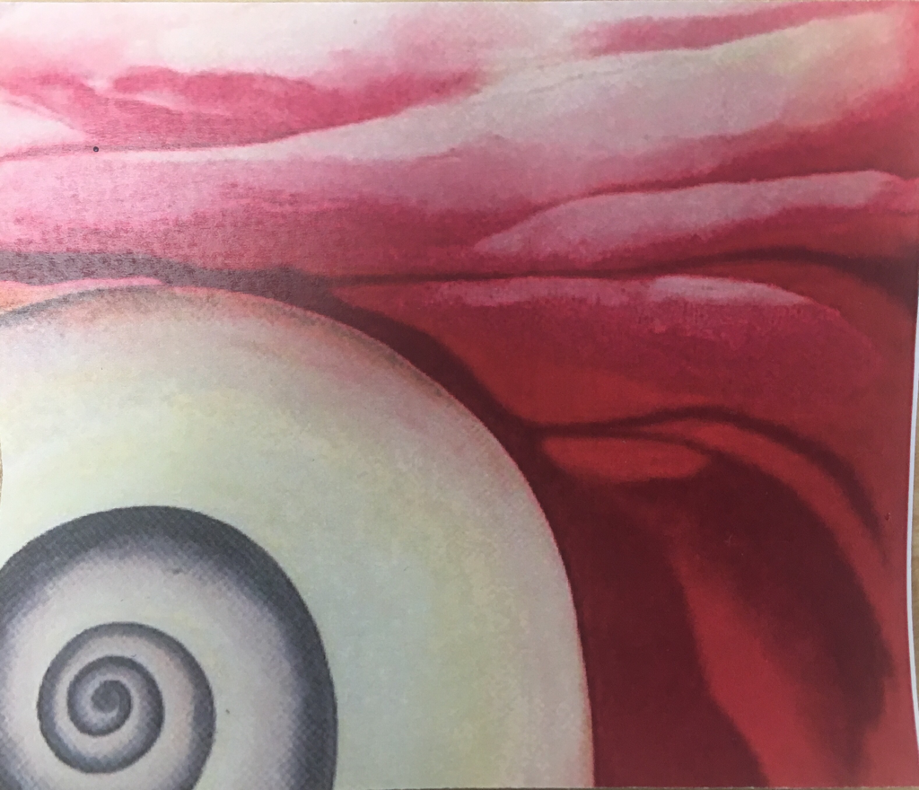
1. Ben shahn did a lot of paintings of people with meaning behind them so I decided to do the same for mine
2. He did a lot of pieces that were plain with not much in it so I decided to take that route
3. His painting "Unemployed" inspired me to choose this idea because in the picture the men were unemployed but here a man is homeless asking for money
4. Since he mostly used any colors in his art I did the same for my art
Describe the craftsmanship of your painting. (Is it neat and well executed?)
I think it is pretty neat but kind of plain and could use more detail in different areas. I spent a lot of time trying to make the white lines on the sidewalk straight and all the same thickness but should have used a ruler to save time. Overall the craftsmanship isn't great but isn't to bad and looks pretty nicely put together.
- What was the most difficult part of this project?
- The most difficult part of this project was probably coming up with the idea. I probably went through about 5-6 ideas before I found the right one in the end but I really don't like my idea and wish I had stuck with one of my ideas from earlier. I think this idea had to many limits for my art unlike my other ideas
- Describe your color choices and how they reflect the work of your chosen artist?
- I chose to use pretty much whatever color works because my artist, Ben Shahn, didn't usually stick with a certain color scheme but went all over the place with it. He sometimes added different texture to objects in the paintings. I was planning to do this but ran out of time as you can tell.
- Describe how the style of your landscape reflects your chosen artist.
- I don't really have a landscape in my art but neither did my artist most of the time. Most of the time his art was of people in a street scene so they might of had a sidewalk or road in the back. I had a sidewalk in the back which reflects similarity to Shahn's art and has the same style.
- What do you think your chosen artist would say if he or she could see your painting today?
- Honestly, i don't think he would be very proud of my art at all seeing that I didn't do much of a good job replicating his style and it maybe would offend him. Although, I think he would maybe see the resemblance of the idea of his art and maybe would critique my work.
- What would you do differently if you were to do this project again?
- If i were to do this project again I would definitely choose a better idea with more options. I would plan it out well and get on it soon so I could finish it on time. I would add texture in my art to better replicates Shahn's art and would make it closer to his style. Finally I would probably choose a bigger canvas to give me more space.
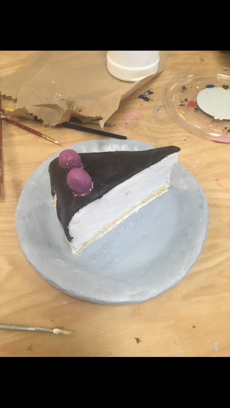
Clay Final
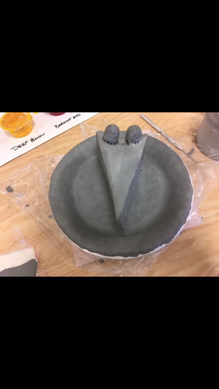
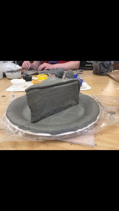
- Describe the craftsmanship of your sculpture. (Is it neat and well executed?)
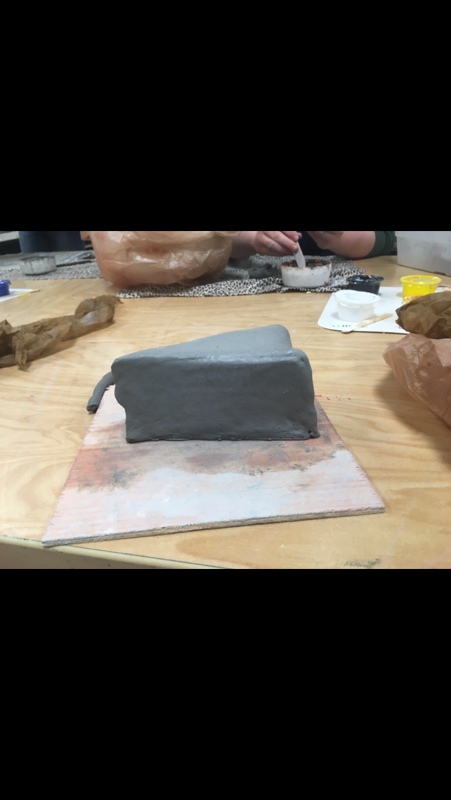
- I think the final result of my sculpture came out pretty neat. It isn't too sloppy but isn't perfect because a normal cheesecake slice is not. It has some texture to make it look rough but is also very neat.
- What was the most difficult part of this project?
- The most difficult part of the project was probably finding the right color for each element of the cheesecake. The raspberries took about 10 different coats to get the right one. The chocolate turned out a lot more darker than it should have been, as well.
- Did your color choices work together harmoniously?
- I think my color choice did work together mainly because it's the color of the normal cheesecake. The plate matches nicely as well and doesn't stand out to much from the other colors. I tried to make the cheese on the cheesecake a very light yellow/brown.
- Is your sculpture interesting from all views?
- I think my sculpture is interesting from all views.
- Each view has something new to offer that you couldn't see from the other. I tried to incorporate a lot of detail in the cheesecake in each view to give it life
- Describe the differences in constructing a sculpture and doing something 2D.
- When you construct a sculpture you have to have sketches of every angle because your making it come to life. 3D is hard to plan out and to create while 2D is more basic and you only use one angle. 2D sculptures also are easier to apply color too because it's a flat surface unlike a rough 3D object.
I created texture in my sculpture multiple ways. The first way was in the cheese. I took small seeds and pressed them all over the cheese. When they burned off in the kiln they really did make it look like the right cheese texture. For the chocolate texture I mostly kept it smooth but used a needle to make some streaks to show it isn't perfect.
Does your sculpture look like the actual food? How did you accomplish this?
I think my sculpture does look like the actual food. It looks almost just like the cheesecake my mom makes except for maybe the color and the glossiness. I accomplished this by taking many pictures of cheesecake from the internet and creating the right one using different elements from each.
What would you do differently if you were to do this project again?
If I were to do this project again I would probably decide to add more. I would maybe add a cup on the side and designs on the plate. I would also maybe plan out my sketches a little more so I could be better guided in my final. Overall there is a lot I would change but am still happy with how the final product turned out.
Clay Sketches
Color Wheel
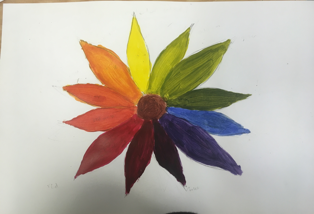
Above is my color wheel. I chose to do this in the shape of a flower. I think it turned out ok but I could have done better with my brush streaks. It was very hard to get the correct values of the different colors and I often had to do several trys of going over and over it to get the right color. Overall, it turned out pretty good and looks nice
Painting section
Above is my painting section project where we were tasked to replicate a picture given in a painting. I think I did ok on this in replicating but could have done better with blending different colors to make changing less noticeable. I also think I should have tried a little harder to get the values exact to match the colors. Overall I think I did pretty good on this other than a few things.
Paint Value Chart
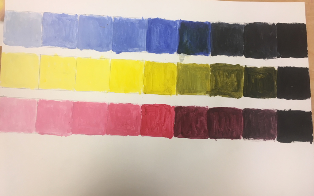
Above is my paint value chart that I did to help with my painting projects. I did blues, yellows, and reds from light to dark. I think I did well on this by making each value a little darker from left to right but could have maybe gone a little lighter on the last few because I added a little to much black. Overall I think I did pretty good.
Prisma color project ( Georgia O'Keeffe )
- Describe the craftsmanship of your drawing. (Is it neat and well executed?) I think the craftsmanship of my art was alright. It didn't have much detail so It wasn't too hard to work with although I had to keep layering to get the certain values. Overall, I think it is neat just maybe needs more shading and detail in certain places.
- Do you think you used a full range of values to create the illusion of depth? I don't think I used a full range of values to create the illusion of depth. I really only used a few values in this piece because that is all I saw in the picture. I think It has some depth but that If I add a few more values and shading, then the depth perception will look better. Overall I need to add a few more values to have used a full range.
- How do you think you represented the style of the artist Georgia O’ Keeffe? I think I represented the style of O'Keeffe pretty well generally. It may not be great, but I took an ordinary thing, zoomed in close on it, and drew it. It is similar to how she does zoomed in pictures of flowers although I didn't have as much detail as most of her pieces.
- Describe your choice of colors/color harmonies and how you used them throughout the artwork. In my artwork I just used the same colors as my photo. Although, I used red and purple blended together which has a nice turnout and I used yellow on the outside that goes well with both of those colors. On the bolt of my drawing, I used black and brown that kind of stands out from the drawing as darker colors.
- How did you create contrast in your drawing? I created the contrast in my drawing by trying to make certain things stand out over others. In the red I tried to add purple to show the darkness of it to help add depth. When trying to add the 3d aspect I had to darken some spots more than they were acually dark in the picture to add that contrast.
- How did you use textures, highlights and shadows to enhance your artwork? I tried to use texture and highlights in my drawing. I tried to use the prisma to show the different textures/values in the wheel by using lines and splotches. In the picture there was not a shadow so I did not add that but tried to add highlights using the white color pencil. These helped show the spots that had different color than the rest.
- Describe any difficulties you had creating your drawing and what you could do to improve your drawing? In my drawing, It was very difficult to get the depth aspect of the skateboard wheel. I had to keep adding layers and layers to try to show any depth. I would improve the different colors I used in my drawing because I only used a few. This would help show the true values of the picture and maybe help with the depth. Overall I think this project turned out all right but needs some changes.
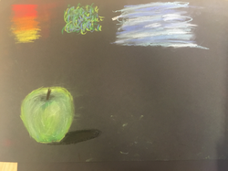
Color Pastel Spheres and Fruit
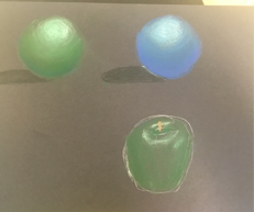
Above are the spheres and an apple I made using the pastel color pencils. On the first sphere, I used one green and went from dark to light to try and make the sphere look realistic. I did the same on the second sphere but just with a blue. I like the pencils but feel they aren't as smooth as regular pastels at all, so I don't think I will be using them for my final. However, They are really good for blending colors together and can be erased which can be very helpful at times. I tried to do the apple with just one green so it doesn't have too much value and tried to show some shading by adding the white values for light.
Pastel Pratice
To the left is my pastel techniques and the apple I tried to draw with a shadow. I like how easy the pastels flow but feel they are a little too messy to use for my final although they are easy to shade and blend with. I tried to show the value of the apple by making it dark near the stem and lighter where the light shows on an apple.
Prisma fruit
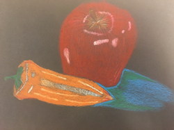
To the left is my attempt at drawing fruit/vegetables using the prismacolors. I think that this didn't come out well and needs a lot of work. The colors aren't blended well, the white stands out too much on the apple, the shadow is not correctly placed and more. I think the shadow needed to be darker and also at the bottom of the drawing and not the side. I think that the pepper should have more shades of orange and the white should be blended better. I think the apple was not blended well and I shouldn't have added the white over the red, but before the red. I tried to redo this piece but it turned out almost the same way. I think I need to keep practicing with my primsacolor skills if I want to use this for the final. I like the way they work but don't have much control while using them.
Prismacpheres techniques
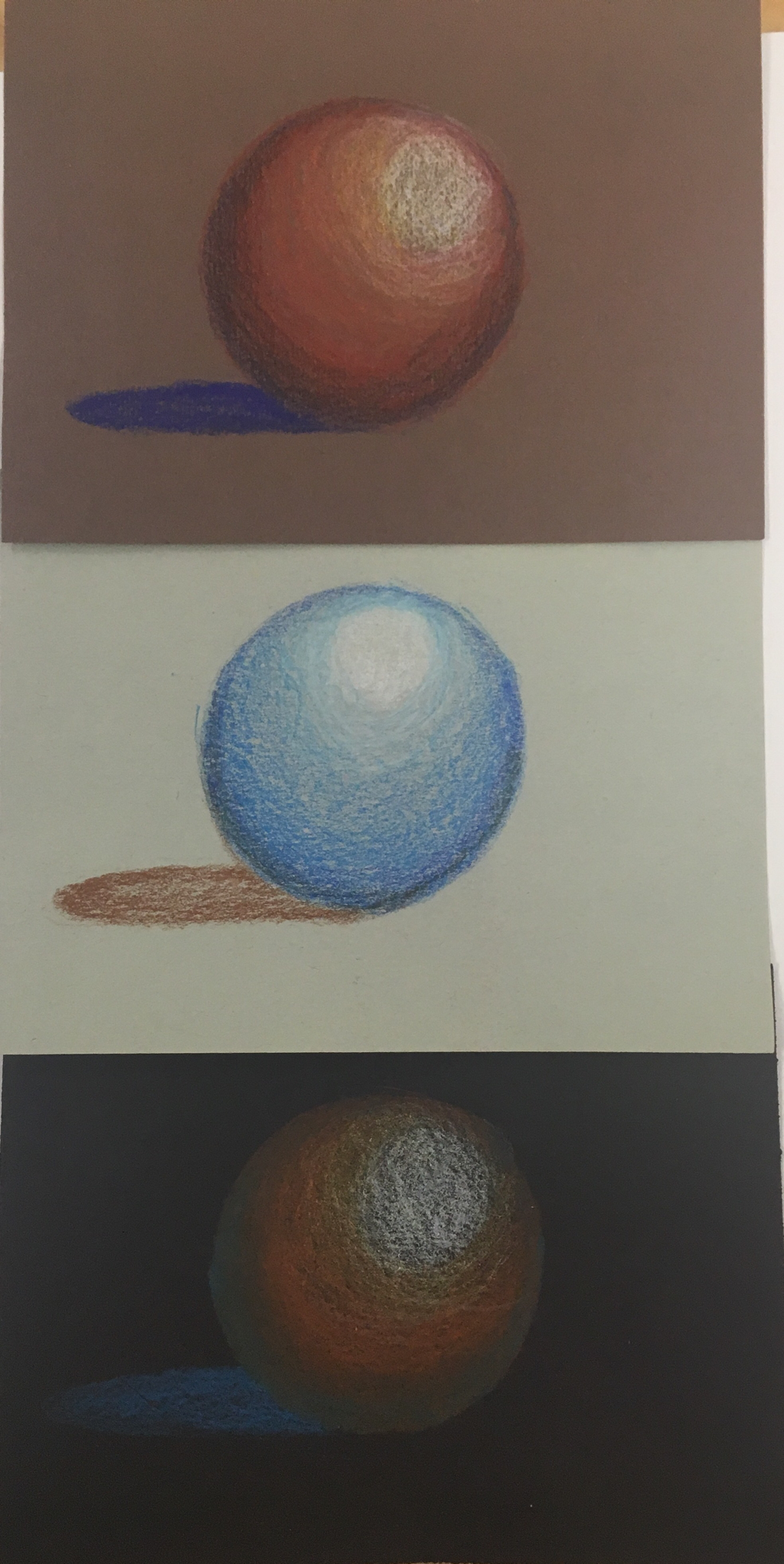
Here are my three spheres I did using prismacolors. I think overall these really helped me get a good feel for how to use and blend prismacolors. I actually did six spheres because I felt the first three needed improvement (not in the picture). On the top sphere I used a warm color scheme with browns, oranges, reds and yellows and a complimentary color shadow of purple. I liked how it looks, and felt the colors go well together. The middle one was my favorite. I just used a light and dark blue and a purple on this sphere. I thought I did a good job of blending here and thought the brown shadow was a nice addition. The last one has a similar color scheme to the first although I added the complimentary color blue to the edges and it didn't come out well. I think it ruined the blending of the sphere and didn't work well with the other colors. I think after making these spheres, I like the primsacolors and will use them on my final project. They are really soft and easy to get the different values of shapes and make blending easier.
Watercolor Apples
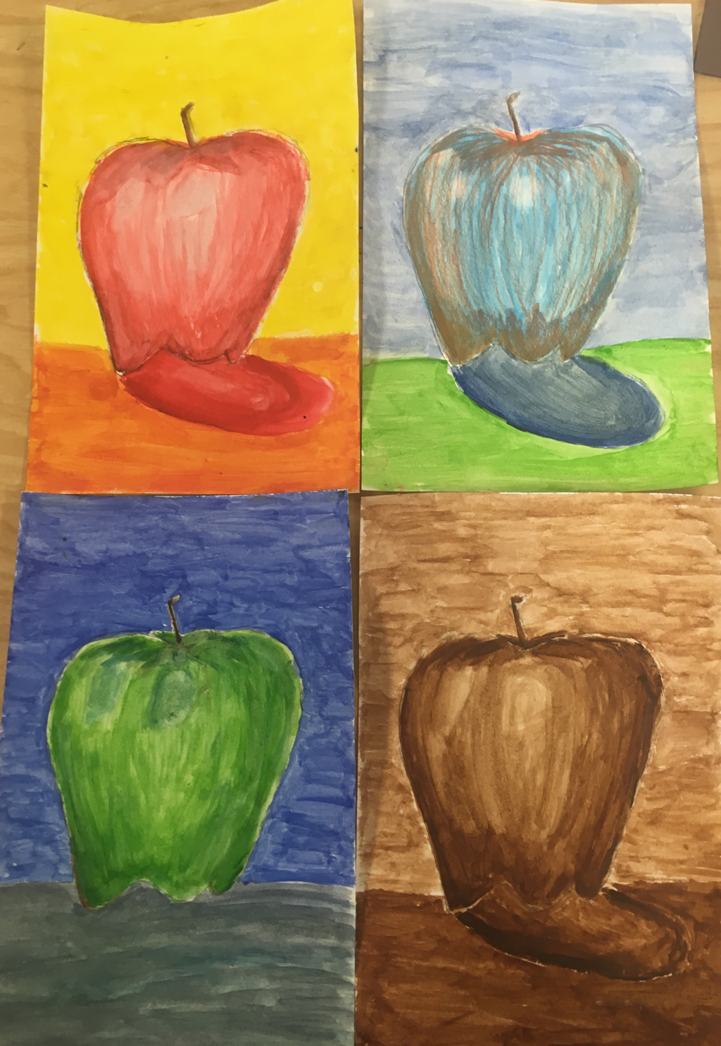
Above are my four final water color apples. It took me about a day and a half to finish painting all of these. The one on the top left is the watercolor pencil apple used with warm colors. I liked using the watercolor pencils because I can shade each value how dark or light I want it to be before going over it with water to blend it together. The top right apple is my prismacolor apple. I liked the idea of this one but I did not like how it turned out. I used the complimentary prismacolor orange on the blue watercolor and It made the prisma color stand out too much. Although, I did apply too much of it with too much pressure. On the bottom left, I did a color apple using cool colors. This is probably my favorite one (even though I forgot a shadow) because It was pretty easy and the turn out was nice. I think the cool colors look nice together. The last apple on the bottom right is my brown monochromatic apple. I think it turned out all right; however, It was hard to show much value because I was using the same color with different shades (by adding more or less water). Overall I like most of these techniques and felt these apples helped my watercolor usage.
Watercolor Pratice Apple
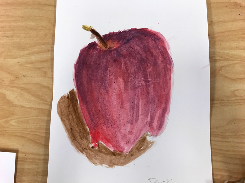
Here is the first watercolor apple I did. I tried to make it look realistic with the values and it turned out better than I thought. I made the shadow a little too dark making it look more like the beginning of a table than a shadow. I found out as I was doing it, I was adding too much water and I was going over it too many times because the paper kept folding up and getting dusty. Another mistake I made was when I added white crayon to the places where I wanted the white to stand out. I just did a small layer with little pressure of white crayon and later found out that it wasn't nearly enough to what I needed. If you look closely you can see the little white crayon lines. Overall this apple was fine but I can definitely improve on my apples to come.
Watercolor Shapes and Techniques
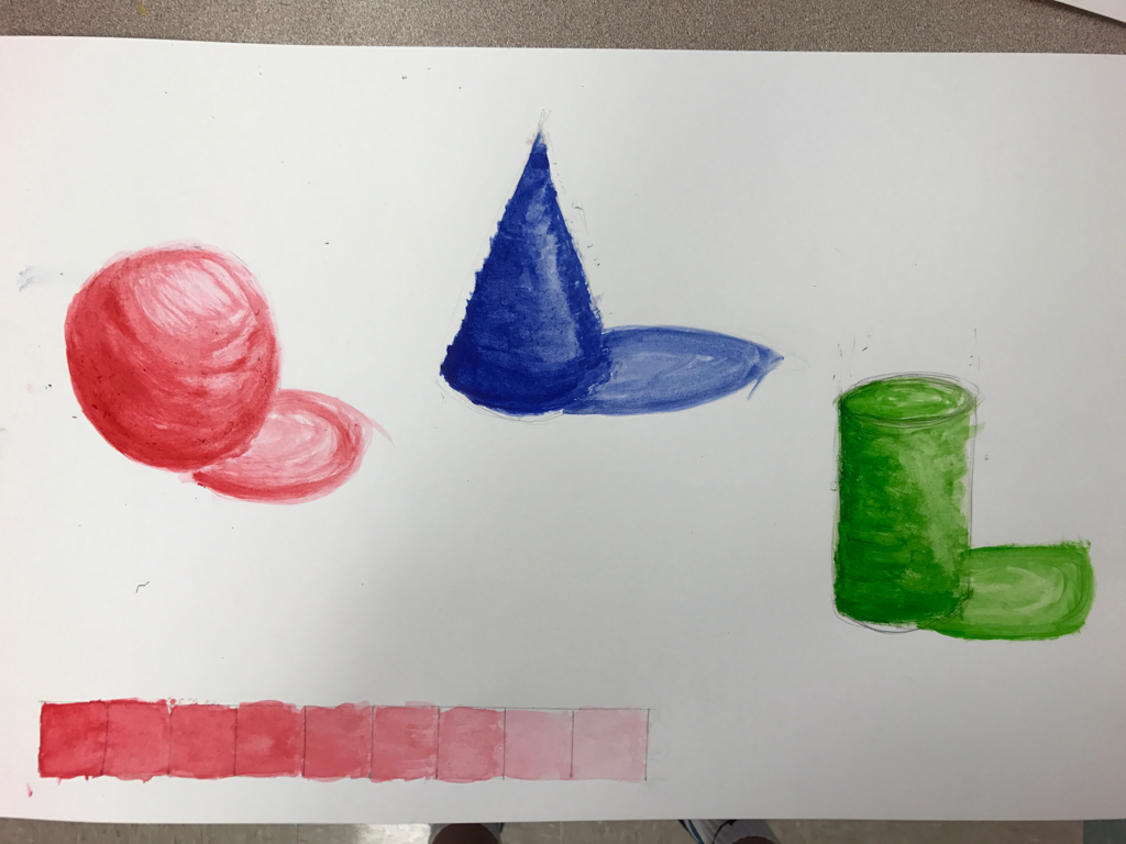
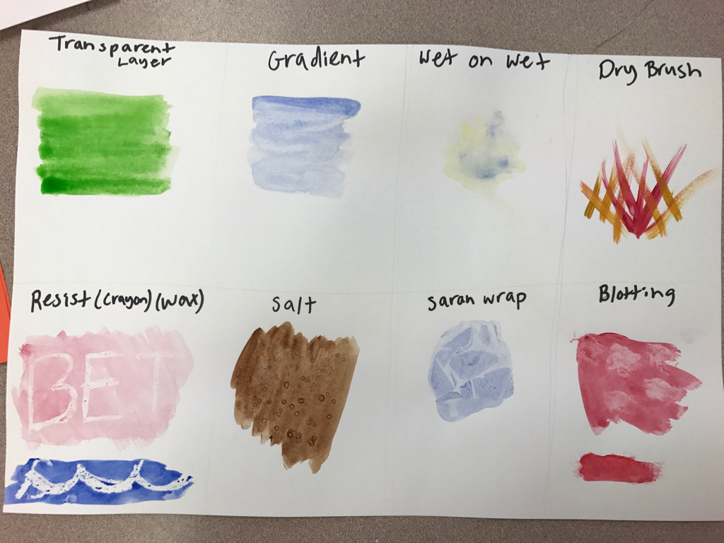
Here is all the watercolor techniques we learned, the shading value chart, and the water color shapes. I liked learning the new watercolor techniques like the salt, crayon and saran wrap. My value chart is kind of blended and doesn't show each value separately that well. On my shapes, I tried to show there realistic values by adding the darker and lighter paint in different areas. They turned out alright but feel I can definitely improve. Overall I like watercolor but am not sure if it will be the technique I use in my final.
Pen and Ink Final
- Discuss your decision on pen and ink techniques. Why you chose to use one or more. In my pen and Ink final I decided to use mainly stippling along with a little hatching. I used stippling because I feel it really brings out detail on the buildings and has a very smooth tone to it. I chose hatching on a few things that weren't needed to be stippled or wouldn't have looked correct.
- How did you use perspective? Why is perspective important? I used two-point perspective in my pen and ink to make the buildings look real. One point has the big building going to that point while another has the smaller building going to it. Perspective is important because it adds a real life effect to a photo by showing someones view on a scene.
- How is texture important in your composition? Texture is important in my composition because it gives the outlook of each thing in the image and how it differs from others. The texture shows the shape and the tiny detail of a bigger object and gives it conformity.
- Why is value so important in this project? Value is very important in this piece because It is what shows what stands out from other things in the drawing. Since the composition is only one color, you have to have value to show the different areas of light and dark. For example, in my piece, I need to make the light-pole darker and thicker in stippling to show the darker value of it.
- Describe your craftsmanship (How well the project is crafted technically) I think the project is crafted pretty nicely. I tried to get the exact proportions of these Downtown Apex buildings and line then up to a vanishing point at the correct angle. I also think my stippling was nice and clean and added a great touch to the finished project. One thing I would change, is making certain values darker than the current. Overall I think this was my best project and the craftsmanship was the best.
- If you could recreate your piece what would you do differently to enhance your final outcome? If I could recreate my piece I would change a few things. First, as I already mentioned, I would make some of the values darker to enhance the values and make some objects more precise. I would not draw any lines straight up with the pen because they stand out too much than if I would have just let them be defined by surrounding stippling.
- When applying the pen and ink techniques why and how is it important to make sure you understand the concepts taught in class? It is very important to know the techniques we learned in class because they are the baseline of your drawing. The five techniques in class are the only things that will shape your drawing. Without knowing these I would not be able to show simple texture or values in my composition or It would have no technique and look sloppy.
- As a growing artist how do you think what you have learned will guide and better your future projects. I think this project will help me a lot in my future projects. Not only did I learn these important pen techniques I can use throughout the year in other drawings but I learned perspective. Perspective is a great skill to know because I will always be able to draw something from any view. Knowing this technique will add the realistic affect to all future drawings and paintings.
Describe how you arranged your composition. Discuss your use of the elements and principles. Is it a successful composition? I decided to arrange my composition in a close up view of one of the buildings with half of another in it. I took up about two thirds of the page and I think it looks nicely mannered. I used the stippling technique on the majority of the picture and hatching on a view minor details. I think the composition was successful in the way the stippling brings all the detail out and has a nice pleasing outcome. Although, I could have gone darker in some areas to bring out the different lighting and textures. Did you use a wide range of values? (A range from white to black with at least 9 values). Explain how is this evident? I think I did use a wide range of values although some areas could have been darker. As you can see I have very light stippling in some places and in others solid black stippling. Some areas do blend together making it hard to see what is actually there. In the future I can fix this by darkening objects edges to show dark values.
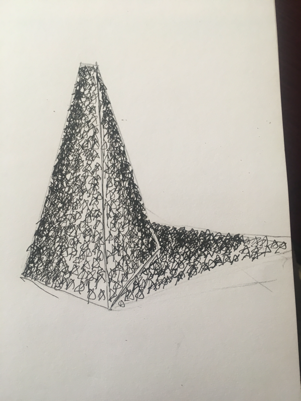
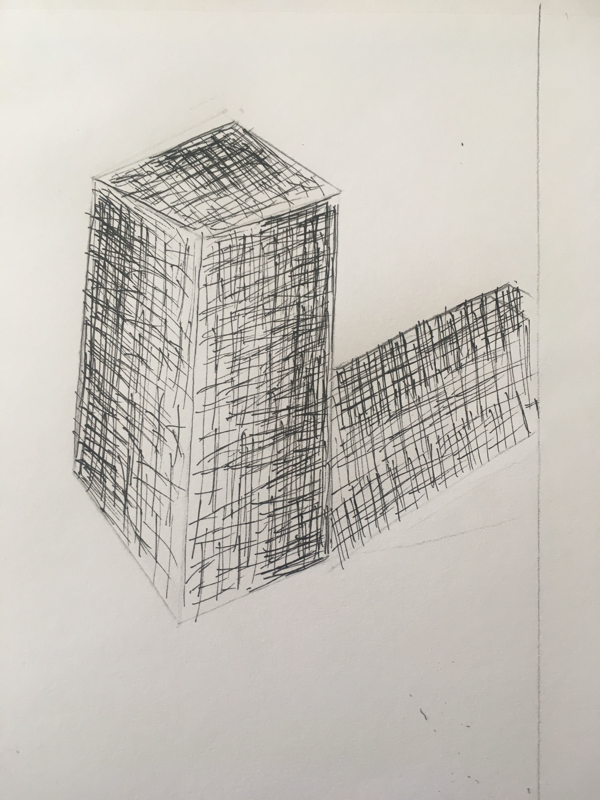
Four drawings of shapes
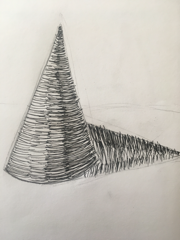
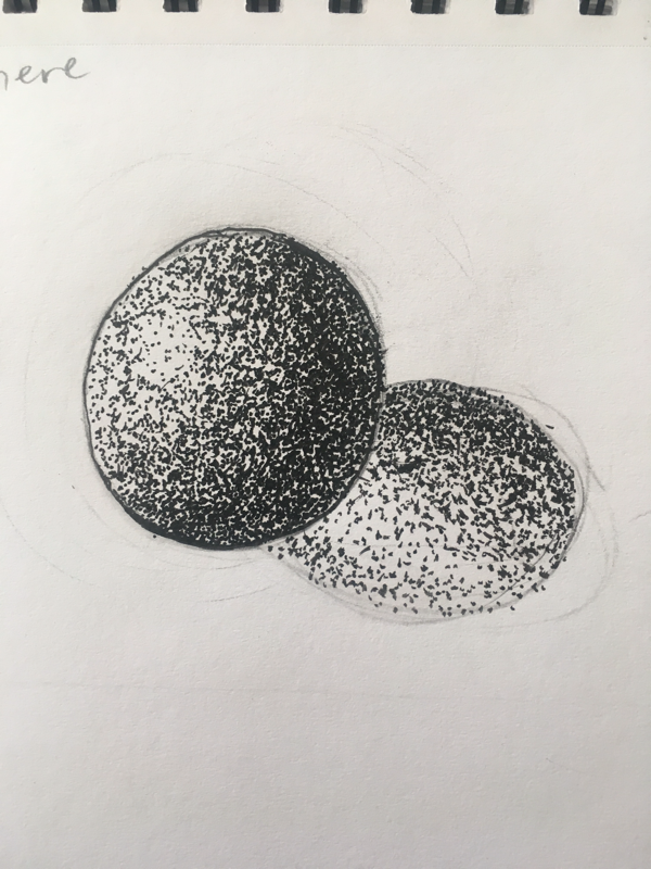
We were given three dimesional shapes and we were assigned to draw them with their shadows using the four different pen techniques. I tried my best on these and they turned out all right. On the cone, I tried to show the realistic values by darkening one side and lightening one side and on the shadow by doing the same. On the sphere I tried to really get the correct lighting for each spot with the stippling to make its 3D shape pop out.
On the pyramid I tried to do the same as the cone but it was weird using a star instead of a technique and I don't think it looks as good. On the rectangle I used cross hatching but it did not turn out how I liked it and I like cross hatching the least. Hopefully this mini project helped my pen technique for my big project coming up.
On the pyramid I tried to do the same as the cone but it was weird using a star instead of a technique and I don't think it looks as good. On the rectangle I used cross hatching but it did not turn out how I liked it and I like cross hatching the least. Hopefully this mini project helped my pen technique for my big project coming up.
Pen value charts
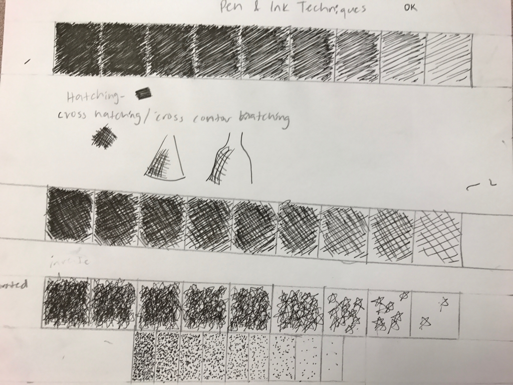
Above are the four shading sequences with four different pen techniques. The first one is hatching which I enjoy using the most because it's not too hard and looks nice. The second is cross hatching with I honestly think looks worse than the others because it looks kind of sloppy and my lines aren't as controlled. The third one is my choice of technique which I chose to do stars. It looks all right, but the fourth one is stippling which looks the best in my opinion. In the value chart for stippling, it took a lot longer than the others so I didn't go as dark for times sake.
Two-point corner of the room
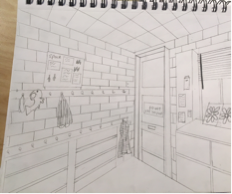
Above is a corner of a room in our class that I drew in two-point perspective. I liked how it turned out cuz it makes things more realistic looking and brings out there shape. It took me about a day to complete this
Three-point perspective
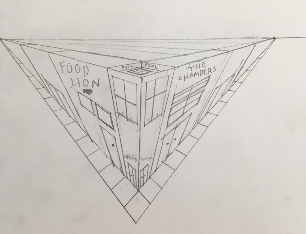
Above is a three-point perspective drawing of a corner in a city. We didn't have much time to do this so I couldn't get into much detail, but I do like how cool it looks from this angle. I did attempt to try to draw a pool on the roof and it turned out all right
Two-point perspective
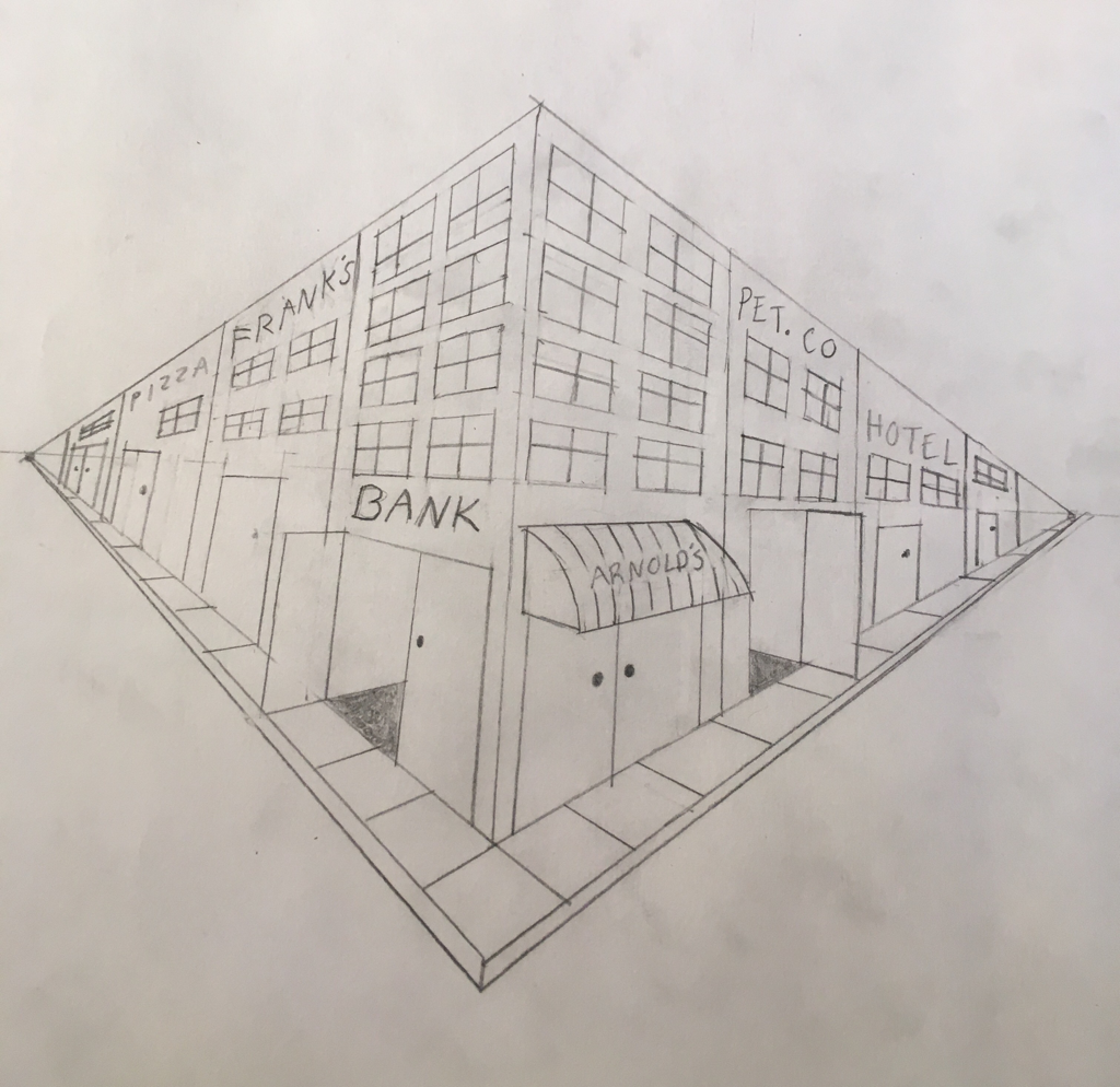
Above is a two-point perspective view of a corner in a city. I enjoy using two-point over one and three-point because I like the way it looks and its the easiest for me to make look realistic. In this image, I don't think I did to bad of a job even though there isn't much contrast.
One-point perspective
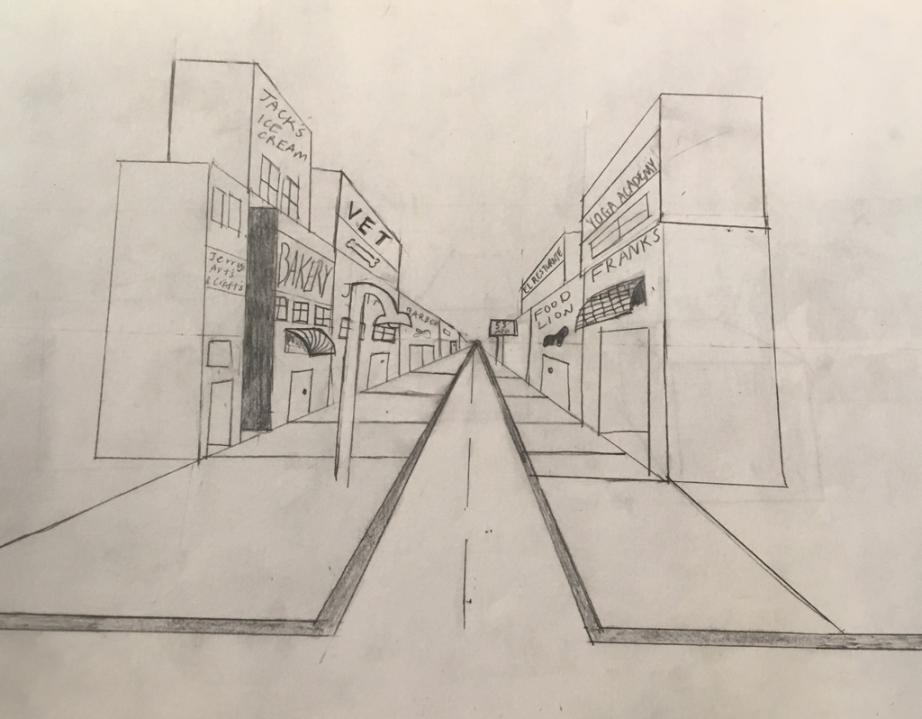
Above is a one-point perspective city mini project I drew, after learning more about how to do this. As you can see, it is a lot better than my drawing from the first day when I didn't understand one-point perspective too well.
Pencil Still Life
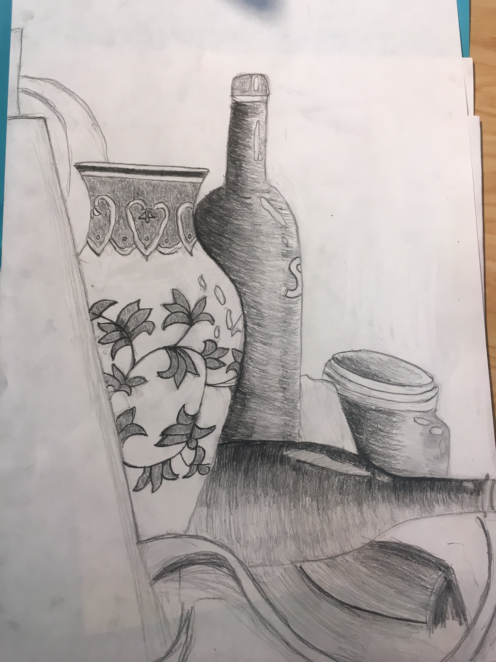
- Describe how you arranged your composition. Discuss your use of the elements and principles. Is it a successful composition? I arranged my composition from left to right. I took out things from the top background from the still life and really put my focus into the bottom of the drawing and each bottle individually. I tried to have two thirds of the drawing filled space and one third white space to make it look good. I darkened things more than they were, to emphasize the certain shades in the drawing and try to make the realness of the drawing really stick out. Although it didn't work well and could be better, I think its a good start to the year.
- Did you use a wide range of values? (A range from white to black with at least 9 values). Explain how is this evident? I used most if not all of the nine values when creating my still life. I tried to make some of the areas very dark to try to make the picture come to life. This is evident because you can look and see all of the different shades in the image. For example, you can see the places I shaded very hard, while in different places I shaded very lightly.
- Explain how your knowledge and creating practice studies with value contributed to your piece. Knowing the different 9 values to use in my art, I was able to create every single light or dark shade there was with just one pencil on the still life. With our practice drawings we were able to see which ones fill up space in the best manner.
- Describe the blending and transitions in your objects (discuss your use of pressure with pencil and other techniques to achieve this). I shaded very dark on the opposite end of the bottles and the cup that the light was hitting. As I moved closer to the light, I would lighten up my shading. To blend the different shades i would try to find a shade in between the two colors and shade it in-between them to mix.
- Explain how your interpretation of texture is essential in capturing the look of the object. The bottles and vase are very smooth, so i tried to use shading to show the smooth curvy shape. I tried to really get the shading down right, to show the realisticness and how the bottles reflect the light. For the cup, I tried to show the part where you screw on the lid my adding the lines and shading it under to try and make it look real.
- If you could recreate your pieces what would you do differently to enhance the final outcome? If I could recreate my piece, I would first try to match the shading of the bottles to the actual bottles. I shaded the bottles how I wanted to, and not how they were in the still life. I would also spend more time detailing the cloth along with detailing and shading the vase better. I rushed both of those instead of spending time on each little thing and making them exactly how they were in the still life.
Four drawings
In the slide show above are my four drawings we were assigned to draw on the first day as a baseline for the class. I struggled with these as I have not done art in over a year and I have never drawn some of these things like the cow and the one point perspective city. Hopefully my artistic skills will grow from these drawings as the class continues.
 RSS Feed
